This tutorial illustrates how to use the R package ggplot2 to build a simple plot. This plot was designed for land managers at the St. Johns River Water Management District interested in rainfall and evapotranspiration in the Lake Apopka area to determine whether the conditions are appropriate for prescribed burns. The plots are generated at the beginning of each month and contain data from the previous month.
Required packages
This script requires the following packages:
library(tidyverse)
library(lubridate)    ## required for the month() function
library(scales)       ## required for the date_format() function
Input data
The input data for this plot is a data frame called Ap_Rain with the following structure:
| Column | Description | Coordinates |
|---|---|---|
| date | date in Date format | |
| MFWRain | Rain in inches at the Lake Apopka Marsh Flow-Way |
Lat:28.67143722 Long:-81.67500639 |
| Ph2Rain | Rain in inches at the Lake Apopka North Shore Restoration Area, Phase 2 |
Lat:28.63771 Long:-81.54675 |
| ET | Evapotranspiration in inches from the Apopka IFAS FAWN station |
Ap_Rain <- read_csv("Ap_Rain.csv", col_types = "Dnnn")
The first few rows of the table look like this:
| date | MFWRain | Ph2Rain | ET |
|---|---|---|---|
| 2016-07-01 | 0.56 | 0.08 | 0.19 |
| 2016-07-02 | 0.01 | 0.28 | 0.15 |
| 2016-07-03 | 0 | 0 | 0.19 |
| 2016-07-04 | 0 | 0 | 0.23 |
| 2016-07-05 | 0 | 0 | 0.23 |
| 2016-07-06 | 0 | 0.01 | NA |
This data frame is not formatted well for ggplot, which works best with single record per line data. The pivot_longer function in the tidy package is a quick and easy way to pivot from wide to long format:
df.long <- Ap_Rain %>%
    pivot_longer(cols = c(MFWRain, Ph2Rain, ET), names_to = "parameter")
Now the first few rows look like this:
| date | parameter | value |
|---|---|---|
| 2016-07-01 | MFWRain | 0.56 |
| 2016-07-01 | Ph2Rain | 0.08 |
| 2016-07-01 | ET | 0.19 |
| 2016-07-02 | MFWRain | 0.01 |
| 2016-07-02 | Ph2Rain | 0.28 |
| 2016-07-02 | ET | 0.15 |
From month to month, the land managers were interested in seeing the same basic plot with updated data. Sometimes there are high rainfall values that would skew the y-axis if we allowed ggplot to autoscale the y-axis each month. Instead, we can fix the y-axis scale to range between 0 and 2. In order to handle high rainfall events, we can a new variable, high, that is used to annotate the plot whenever rainfall exceeds 2 inches:
df.long <- df.long %>%
    mutate(high = case_when(value > 2 ~ value, value <= 2 ~ NA_real_)) %>%
    arrange(desc(high))
After sorting by the new variable, high, the first few rows of the data frame now look like this:
| date | parameter | value | high |
|---|---|---|---|
| 2016-07-12 | Ph2Rain | 2.46 | 2.46 |
| 2016-07-01 | MFWRain | 0.56 | NA |
| 2016-07-01 | Ph2Rain | 0.08 | NA |
| 2016-07-01 | ET | 0.19 | NA |
| 2016-07-02 | MFWRain | 0.01 | NA |
| 2016-07-02 | Ph2Rain | 0.28 | NA |
ggplot2
The ggplot2 package was created by Hadley Wickham, Chief Scientist at RStudio. ggplot, or grammar of graphics plot, is built around the concept of layering different components of the graphical display. These components include the data, aesthetic mapping, geometric objects, scales, statistics, and facets. The basic structure is:
ggplot(data = yourdata,
       aes(x = your_x_variable,
           y = your_y_variable)) +
    geom_point() +
    scale_x_date(date_breaks = "1 month",
                 date_labels = "%b %Y") +
    stat_sum() +
    facet_wrap(~your_grouping_variable)
The following example makes use of the data, aesthetic mapping, geometric objects, and scales components.
Creating a plot
The first step is to identify the input data and aesthetic mapping. This is done within the ggplot function, assigning the dataframe to the data argument and using the aes function to assign variables to x, y, and more. To help illustrate each of the layers of the plot, we can assign the function to a variable, p, and add layers to the function with each step.
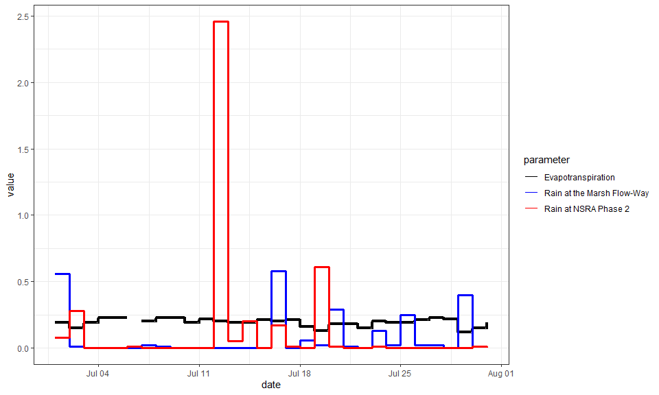
p <- ggplot(data = df.long, aes(x = date,
                                y = value,
                                group = parameter,
                                color = parameter,
                                size = parameter)) ; p
As you can see, we have a plot prepared with the x and y variables in the appropriate place, but there is no geometric object added yet. To add a geometric object, we can simply add a geom_* function. In this case we will use a stairstep plot with the geom_step function.
p <- p + geom_step() ; p
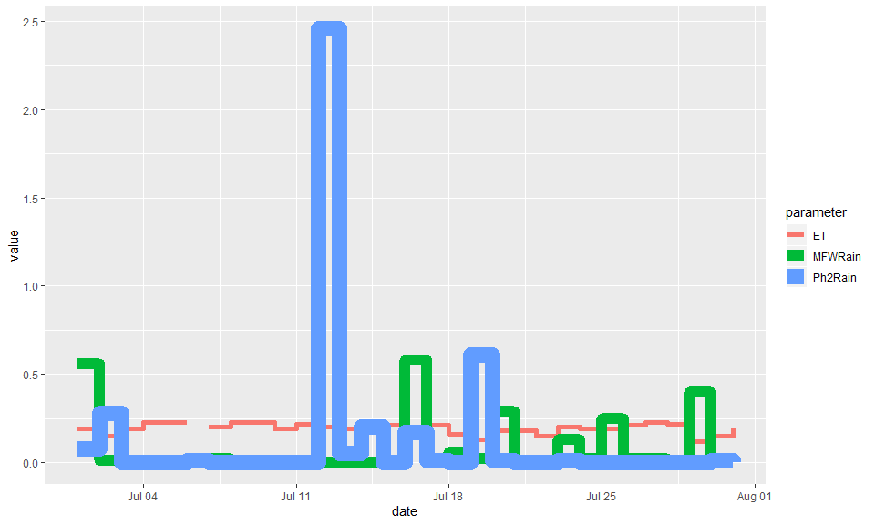
While the plot shows all the lines, the thickness of the lines varies considerably. We can change this by using the scale_size_* family of functions. In this case, we use scale_size_manual because the variable parameter is a discrete variable and we would like to customize the values assigned to it. By setting the guide argument to “none”, we avoid adding a legend indicating the sizes of the lines.
p <- p + scale_size_manual(values = c(1.6, 1.4, 1.4), guide = "none") ; p
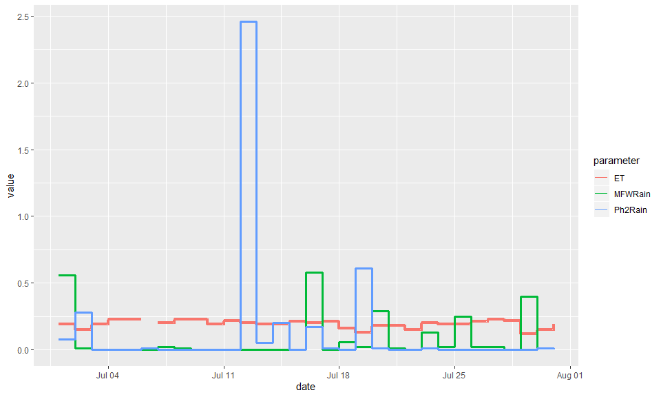
The colors and labels for the lines can be changed using the scale_color_* set of functions. As with the size variable, we can use scale_color_manual to customize the color values and labels for a discrete variable.
p <- p + scale_color_manual(values = c("ET" = "black", "MFWRain" = "blue", "Ph2Rain" = "red"),
                            labels = c("Evapotranspiration",
                                      "Rain at the Marsh Flow-Way",
                                      "Rain at NSRA Phase 2")) ; p
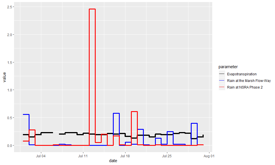
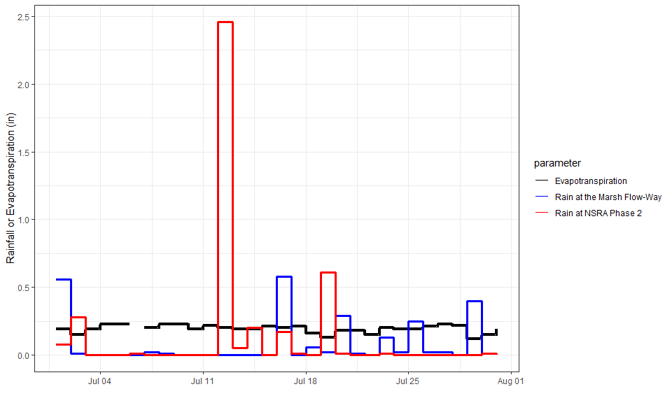
ggplot2 has built-in themes that allow you to change the non-data aspects of the chart. Here we switch to theme_bw, which is a simple black and white theme.
p <- p + theme_bw() ; p
We can update the axis labels with the xlab and ylab functions. Here we remove the x label and add a more informative y label.
p <- p +
    xlab("") +
    ylab("Rainfall or Evapotranspiration (in)"); p
We can also add a title with ggtitle.
p <- p + ggtitle(paste(month(df.long$date[1], label = T, abbr = F),
                       year(df.long$date[1]),
                       "Rainfall and Evapotranspiration")) ; p
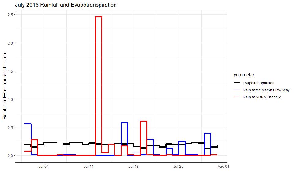
The theme function is where we can change text elements and design components. Here we increase text size for axis labels and titles and horizontally adjust x-axis text so that the left edge aligns close to the tick marks. We remove the legend title, increase legend text size, move the legend to the bottom, and increase the title text size.
p <- p + theme(axis.text = element_text(face = "bold", size = 11),
               axis.title = element_text(face = "bold", size = 17),
               axis.text.x = element_text(hjust = 0.1),
               legend.title = element_blank(),
               legend.text = element_text(face = "bold", size = 14),
               legend.position = "bottom",
               title = element_text(face = "bold", size = 20)) ; p
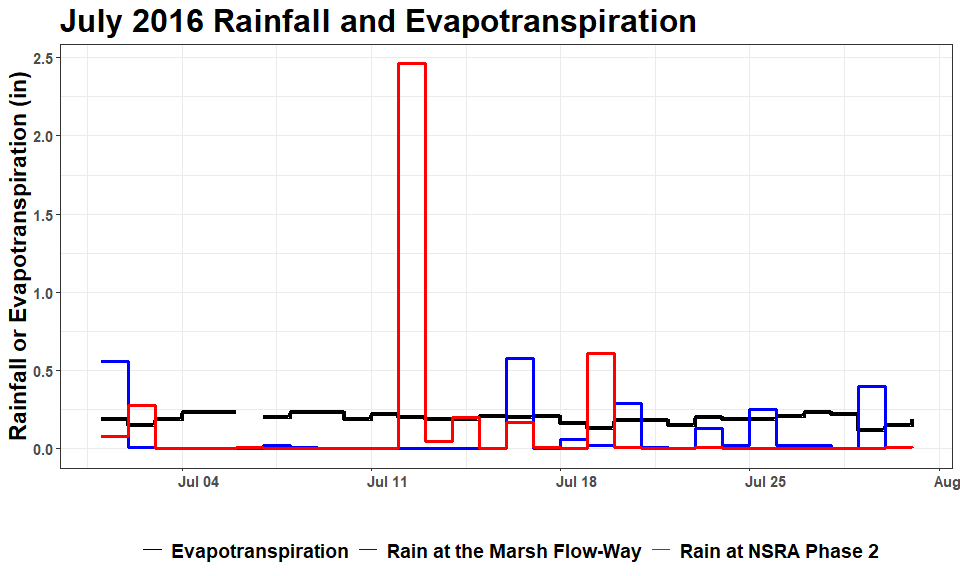
To improve the x-axis labeling, we first create a vector that defines the date breaks to span from the beginning to the end of the time series (month), in 2 day increments.
break.vec <- c(seq(from = min(df.long$date),
                   to = max(df.long$date) - 1,
                   by = "2 days"))
break.vec
##  [1] "2016-07-01" "2016-07-03" "2016-07-05" "2016-07-07" "2016-07-09"
##  [6] "2016-07-11" "2016-07-13" "2016-07-15" "2016-07-17" "2016-07-19"
## [11] "2016-07-21" "2016-07-23" "2016-07-25" "2016-07-27" "2016-07-29"
Now we can use the scale_x_date function to set the x-axis labels for every other day starting on the first day of the month.
p <- p + scale_x_date(breaks = break.vec,
                      limits = c(min(df.long$date), max(df.long$date)),
                      expand = c(0,0),
                      labels = date_format("%b %d")) ; p
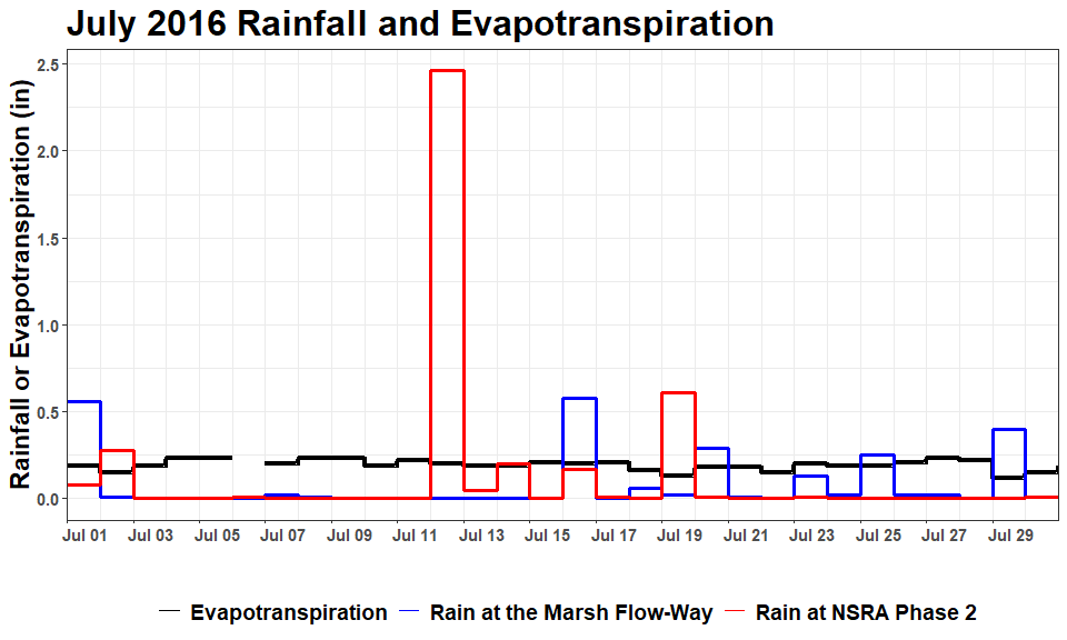
Recall that this plot was designed to be reusable from month to month, so we want a consistent range displayed on the y-axis. Here we use the coord_cartesian function to set the y limits to range from 0 to 2 (with a little buffer). Note that coord_cartesian is required here if we want to show data that goes outside the limits, because the ylim function will omit data points outside the set range.
p <- p + coord_cartesian(ylim = c(-0.1, 2.1)) ; p

Lastly, we want to know what the rainfall was when it rained more than 2 inches. We can do this using another geometric object, adding text to the plot with the geom_text function. We assign different aesthic mapping arguments to this object, because it should not inherit from the original aes call within ggpplot. We do not want to add this text to the legend, so we set show.legend to FALSE.
p <- p + geom_text(aes(x = date + 0.5,
                       y = 2.0,
                       label = ifelse(is.na(high), "", high),
                       group = parameter,
                       color = parameter,
                       fontface = "bold"),
                   size = 3.5,
                   show.legend = F) ; p
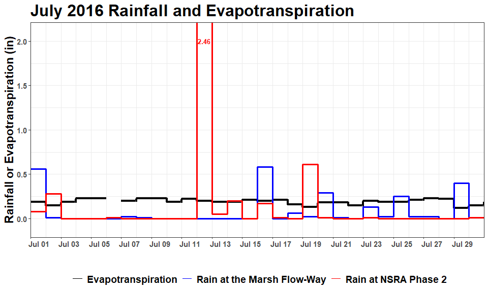
The finished product is a figure that is shared with land managers monthly to help them with decision-making.